
CLIENT: MONDO
"You know the thing about a shark, he's got... lifeless eyes, black eyes, like a doll's eye. When he comes at ya, doesn't seem to be livin'. Until he bites ya and those black eyes roll over white. " - Quint
SOLD OUT
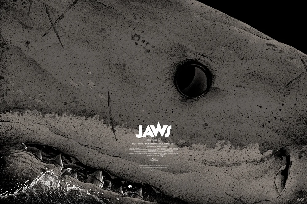
This was overwhelming to say the least. Haha. When Mondo approached me to do a JAWS poster I jumped at it right away. About 20 minutes later it settled in that I was actually doing a JAWS poster. Then anxiety bludgeoned me upside the head. Aside from a film which has one of the most iconic posters beautifully created by Roger Kastel - the film also has hundreds of existing pieces of artwork by some incredible artists. How could I differ from what exists? How can I capture this film without using the same imagery thats been used before? How can I make this mine?
I didnt want to reference a person, or the boat in size comparison to "Bruce" but I wanted to capture size. I wanted to capture menace and I didnt want there to be a lick of blue or an oceanic palette. I opted to focus on his black eye, paying homage to Quints famous speech noted above. This had to be the darkest I could make it...
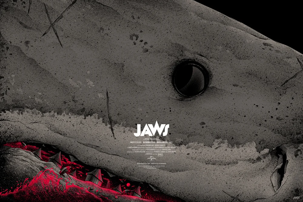
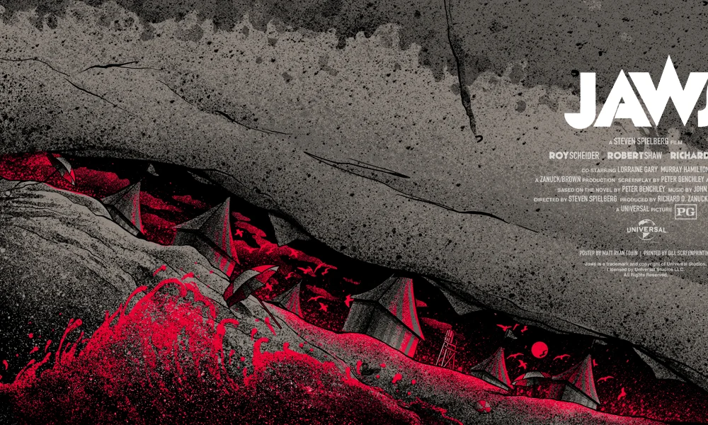
I decided I was going to make Bruce literally too big to fit on the poster. But there had to be a clever element included. After rewatching the film a few times - I noticed the changing tents on the beach resembled shark's teeth. That was it. I made Bruce's entire mouth a beach setting. Tents as teeth, completely desolate at night / abandoned beach balls and umbrellas. The Variant would depict a blood red sky and the water rushing up onto the shore would also glow red like blood running up the shark's gums and teeth.
Oh there's also a fin in the eye's shine. Maybe overkill on the visual metaphors...but fuck it.
36" x 24" SCREEN PRINT
REGULAR EDITION OF 275
BLOOD VARIANT EDITION OF 125
PRINTED BY D&L