
CLIENT: SKUZZLES
”Ted, if I die you can have my Megadeth collection.”
”But dude, we’re already dead?”
”Well then theyre yours, dude.”
”Aw thanks, dude” - Bill S. Preston Esq & Ted “Theodore” Logan
REGULAR EDITION | BUY NOW
METALLIC VARIANT EDITION | SOLD OUT
Where do I even begin? This is my favourite film of all time. It set the path for pretty much everything I'd do in my young adult life. It was responsible for inspiring me to pick up a guitar and learn how to play which lead to a pretty successful life playing in a pretty successful band that took me across the world and back again and even to the billboard charts. Which in turn, exposed my design work to larger bands we toured with to even bigger bands and brands and landed me in one of the greatest jobs on the planet.
No pressure right?
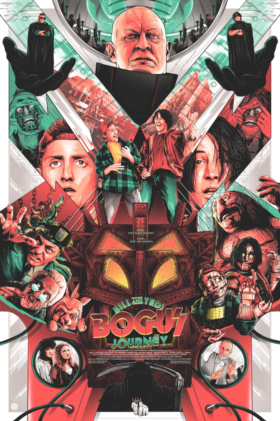
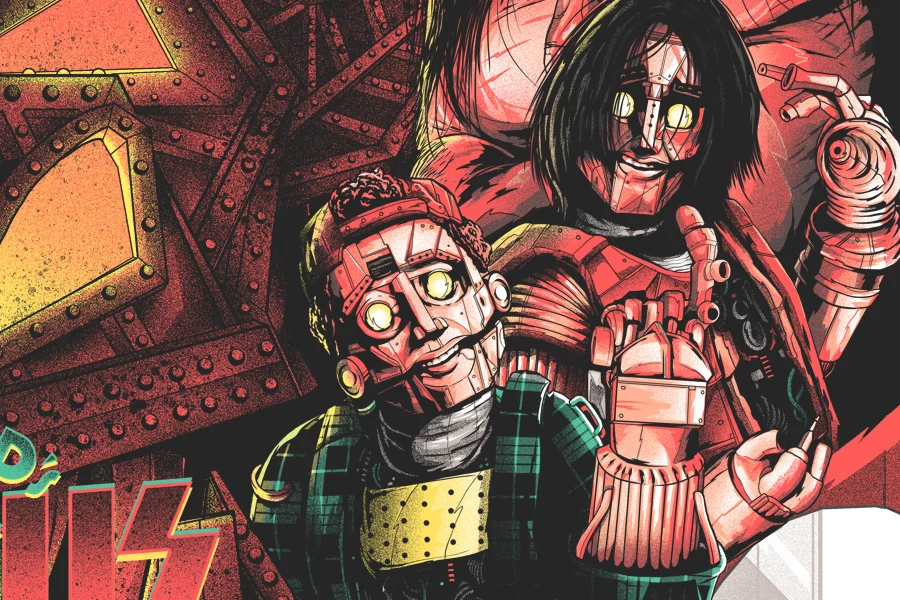
This is the longest I have ever spent on single poster. About a year. I really have to thank my fellow Canadians SKUZZLES for their endless patience as I tried to conquer this. So many times I actually almost jumped ship because I felt I couldnt do it justice and it was starting to drive me insane. I was way too close to it. So many failed composition attempts and ideas that didnt gel and endless accosting of my artistic peers for advice. A lot of pressure to make something striking and fun but not overly fan-serviced. After much sweat and anxiety and hair lost I decided to hit The "Fuck It" Button and make the most ridiculous and out-there-jam-packed poster I could. Coming from a guy who tends to prefer and lean on more simplistic and conceptual approaches this was a big jump...but one I'm happy I took.
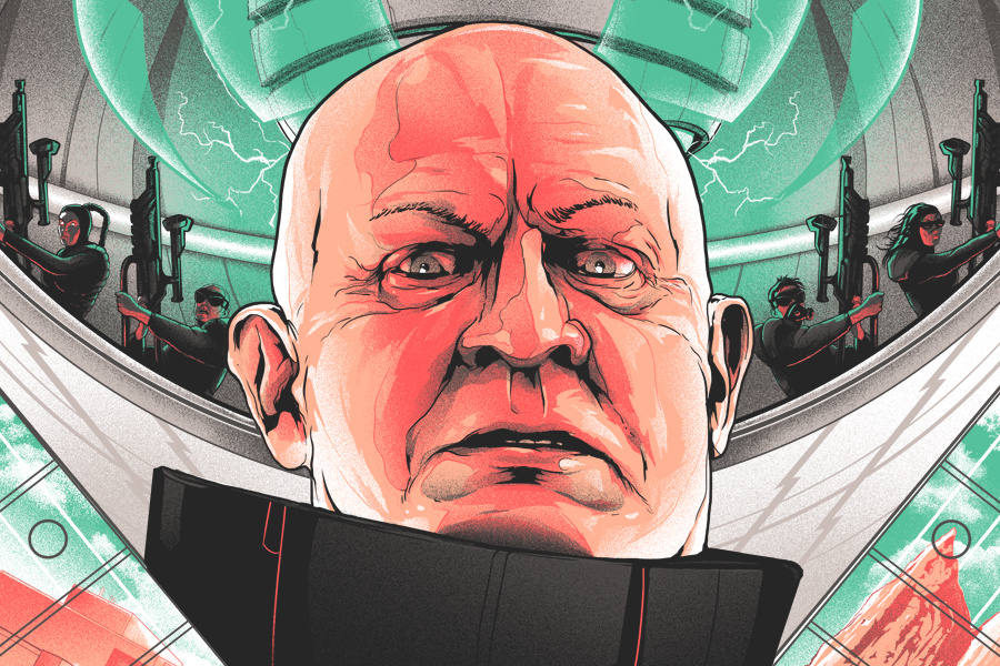
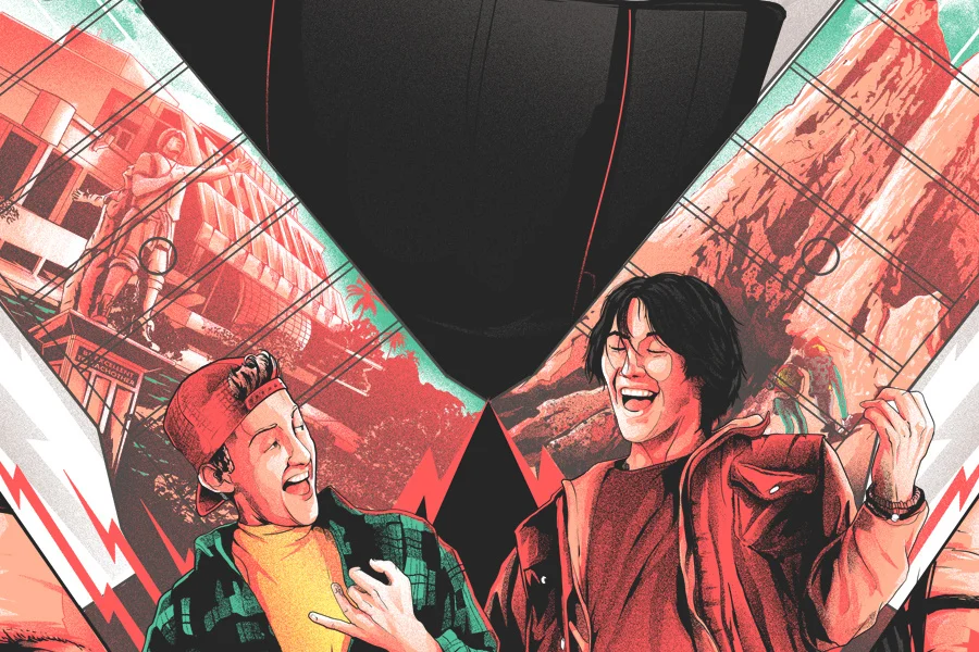
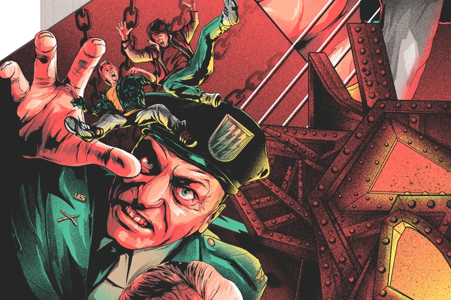
One of the biggest struggles was coming up with a compostion that could be mirrored with a poster for the films predecessor, Bill & Ted's Excellent Adventure. It had to work for both movies side by side but it also had to be cool and interesting. I didnt want it to lack structure. Thats where the crossed flying V guitars came into play. Helped create pockets for imagery and kept things symmetrical. That was the hardest part to nail down. I wanted Bill & Ted to be central and smaller, atop a stage-like structure surrounded by an overwhelming world of characters and imagery much larger than them. Somewhat symbolizing their complete obliviousness and that crushing sort of pressure to write the song that saves the world...perhaps even the weight I felt trying to give this film its worthy poster. Once that was sorted out it was a matter of fitting in certain elements tastefully.
This is an outrageous film and it required a outrageous poster.
I started to see why the original one sheet was Bill, Ted and Death against a white background;
It's impossible to tell this films outlandish, crazy, most excellent story in a single image.
I guess thats what I tried to do.
The thing is; I still think if you hadnt seen the film, perhaps a poster this outrageous just might make you want to.
M.
REGULAR EDITION OF 180
24" X 36" SCREEN PRINT
PRINTED BY D&L
METALLIC VARIANT EDITION OF 75
24" X 36" SCREEN PRINT
PRINTED BY D&L